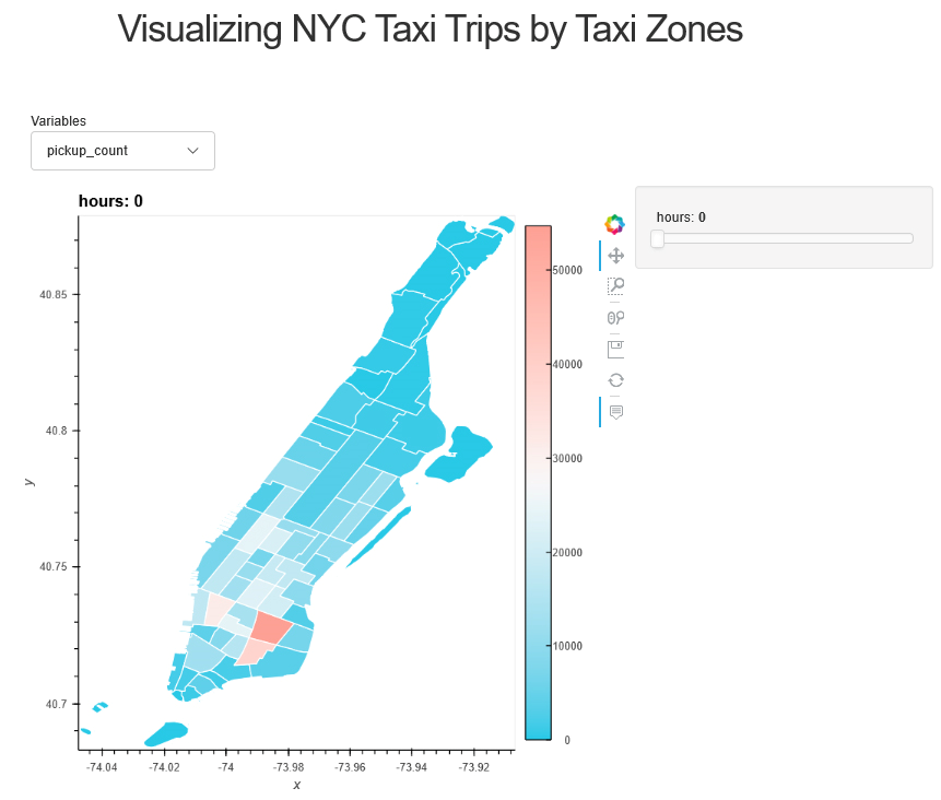
Panel: How many taxi trips in a taxi zone?
Introduction
The aggregated count data is usually a more effective method to reflect a more general distribution pattern of point data. Here the analysis classifies the NYC taxi data into NYC taxi zones and builds a panel app to visualize the results.
Accordingly, the taxi zones based on the neighborhood tabulation areas. The aggregated count data in pickups and drop-offs gives one a sense of which neighborhood is a more popular origin, and which neighborhood is the most desired destination. It also provides the mean value of other related variables: tip amount, trip distance, passenger count. Since these variables are able to roughly reflect the travel patterns and socioeconomic status of each neighborhood. The variables are in hourly groups so that it further shows the inner-neighborhood changing pattern for each variable. Here we use the coordinates of pickup locations, and the data on January 15th, 2015 because the dataset is too large.
User Guide
One can select desired variables from the drop-down menu. The time slider at the right sides allows user to specify the 1-hour time interval.
Why not have a try and play around with the taxi trips data? (Please give it some time. Take a sip of coffee first~:D)

See the notebook for more details.